Anyone who wants to be successful with his company cannot avoid an online presence these days. Both content management systems (CMS) and modular systems are suitable for a website or an online shop. Both variants are available from various providers; magazine t3n compared 13 CMS. With modular systems, there are low monthly costs for the domain and administration of the website. Content management systems are offered open source, so that license fees do not apply; only the domain registration and web hosting cost money. If a company rents a web hosting service, it must choose a hosting operating system – Linux and Windows are available. The digital guide from 1 & 1 provides detailed information on these two hosting solutions. As far as structure and layout are concerned, there are some rules that make a website visually appealing and user-friendly.
Improve user experience
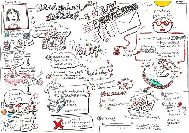
User experience design describes a process of improvement in web design . The satisfaction of website visitors increases when content (e.g. texts) and interaction options (e.g. links) are more easily accessible and can be used intuitively. The philosophy behind this is that the user should always reach their destination in the fastest and most convenient way – regardless of whether they are simply looking for information or want to buy a product or service.
Pave user path
At best, the user is guided from one section to the next by anticipating their goals and needs. Here are five things to consider:
- The visitor to the website usually perceives elements at the top of the page first and considers them to be more important accordingly.
- Ordinary website navigation is the easiest for the user to use.
- The more pages there are, the more often it has to be loaded. It is therefore advisable to use the vertical when designing the page, because scrolling is faster than clicking.
- So that the user does not leave the page prematurely, notes should be placed on the following topics or information in a clearly visible manner.
- Blue and / or underlined text makes links stand out. At the same time, this text should provide information on where the link leads to. Visited links should differ in color from links that have not yet been visited. Buttons that trigger frequently used actions on the website should be easily accessible.
Consistent and flat navigation
Website operators lose users if the hierarchy of the website spans more than three to four levels. A so-called “sticky menu”, a navigation bar at the top, helps the user to move quickly between the different subdomains without having to scroll all the way up each time. In the best case, the navigation labels consist of a maximum of three meaningful words. Because the user wants to know what content he can see after clicking the button. Conversely, it is also important to show the user how he got to the current element. This works best with the so-called breadcrumb navigation. The name is borrowed from the fairy tale “Hansel and Gretel”, in which the two children try to find their way back home using scattered bread crumbs.
Optimizing a website for its user-friendliness is a process and is therefore never complete. Essentially, all of the aspects mentioned help to make the use of the website as informative and easy as possible. Good usability works in the background – the user only determines how much fun navigating this site.
Flickr Designing Better UX Deliverables Jenny Cham CC BY 2.0 Certain rights reserved